Product Navigation at Clove
PROBLEM
As Clove expanded beyond healthcare footwear into broader lifestyle categories, the website’s navigation system became a bottleneck. The original menu was built around a narrow set of user needs and didn’t reflect the brand’s evolution or growing product catalog.
OUTCOME
I led the end-to-end redesign of Clove’s site navigation to improve product discoverability, reduce friction in the purchase journey, and align the experience with the brand’s new positioning: “Wear What Feels Good.”
ROLE
Lead Product Designer
TIMELINE
Feb ' 25- Apr ‘ 25
TEAM
Product Designer (me)
PM (Faith Mamaradlo)
3 Engineers
Creative Director (Wade Keller)
🧩 The Problem
Clove was transitioning from a niche healthcare sneaker brand into a comfort-driven lifestyle brand with a wider audience and product variety. However, the legacy mobile navigation system had several issues:
01
Fragmented Entry Points
Users had to go through multiple, disconnect layers to get to where they wanted
02
Too many clicks
Core products were not easily available
03
Lack of visual hierarchy
There was an increased cognitive load with multiple competing choices and no visual anchors
03
Lack of Engagement
We noticed a clear lack of engagement with certain sections, especially the explore section and the color filters
🔍 User Research
& Analysis
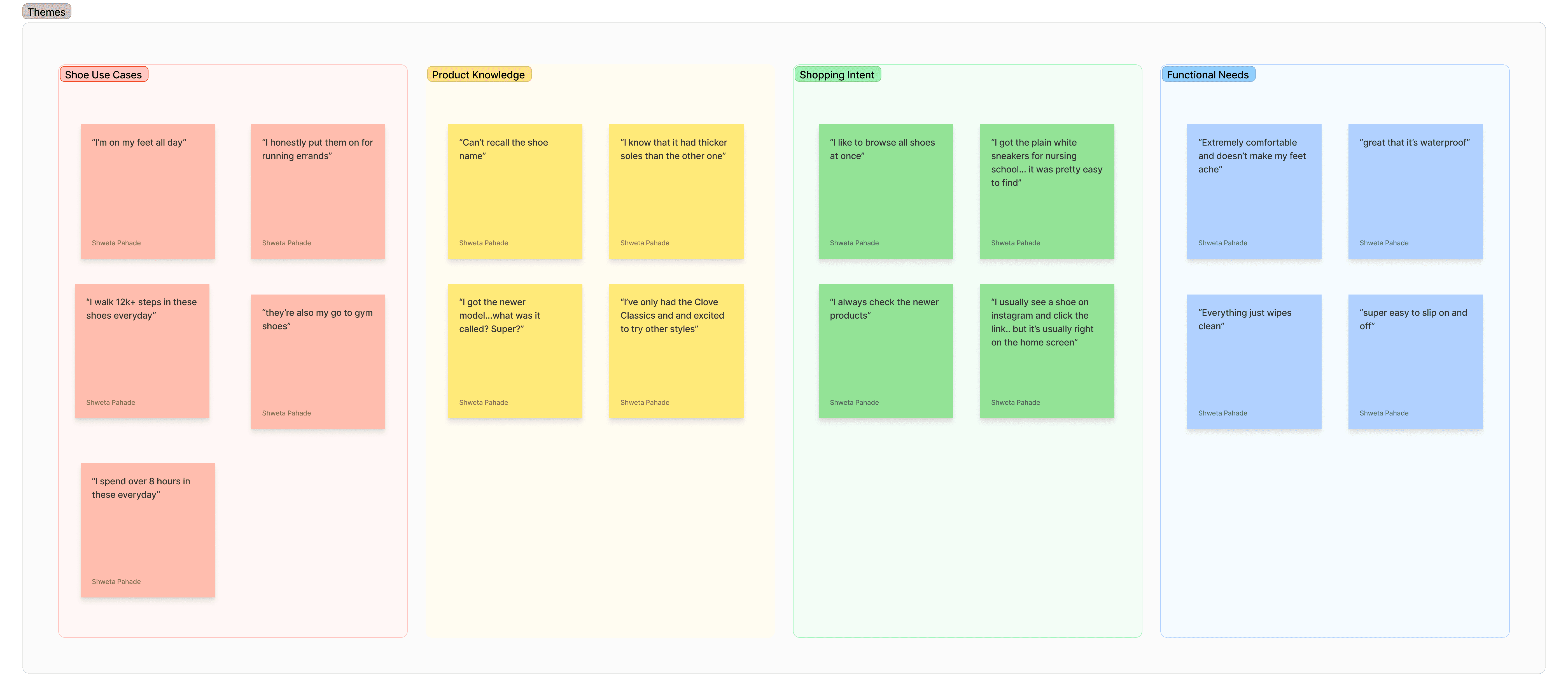
I conducted a series of 1:1 user interviews with both returning and first-time customers. Our goal was to understand how customers perceive the brand, shop through the website, and talk about the products to help us define a more intuitive, user-centered information architecture. We focused our questions on three core areas:
01
Brand Identity & Mental Models
We asked questions like:
“How do you describe Clove sneakers when people ask about them?”
“What is the sneaker function or feature that brings you back the most?”
Key insight: Users described shoes by their function (cleanable, slip-on and comfortable sneakers) and their height (SuperCush™ and Clove Classic) in detail, but had a hard time recalling the sneaker name.
02
Website Navigation Behavior
We asked questions like:
“What are you usually looking for when you open our navigation?
“Without using the search function, can you navigate to this shoe *picture*"
Key insight: Although most users were able to find specific products, they took a while (+30s), and quite a few steps to get there. This established a need for a faster, more visual access to styles and features.
03
Product Knowledge & Terminology
We asked:
“Do you understand the different functions of our sneaker styles?”
Key insight: There was low recall of product style names (e.g., Clove Forte, Clove Alto), but high recall of functionality (e.g., breathable, waterproof, slip-resistant).
🔥 Data & Heatmap Audit
Luckily, I had a solid amount of data to help guide my design decisions. I used tools including Hotjar, Microsoft Clarity, GA4 and Shopify Analytics
02
To Inform the Redesign, i:
Audited click maps and scroll heatmaps to understand drop-off points
Reviewed Shopify analytics to identify top-performing and underperforming navigation links
Watched recordings to identify pain points, and time take to reach PDP
Identified key top searches from our users
Mapped out all existing user journeys from homepage and menu entry points
Benchmarked navigation from brands like HOKA, Allbirds, and Baggu
Collaborated with brand and merchandising teams to align on seasonal goals and evolving customer personas
Key insight: Users wanted faster, flatter access to core products. The deeper they had to click, the more likely they were to drop off.
✏️ Design Process
My design process was iterative, and extremely collaborative. I worked across many teams including Brand, Creative, CX and Marketing to determine key Information Heiarchy
01
Reworking the IA (Information Architecture)
I consolidated and restructured the navigation around high-intent user goals. The goal here is to reduce extra clutter and retain elements that aided product discovery and education.
02
Wireframes and Prototypes
I created mobile-first wireframes with flatter hierarchies and grouped key actions more prominently. Going into the designs, I knew what style guide I wanted to use, but had to figure out how I could reduce cognitive load and support quicker decisions. Here are some earlier wireframes:
💡 The Solution
The following includes a breakdown of both the designs, and the choices I moved forward with
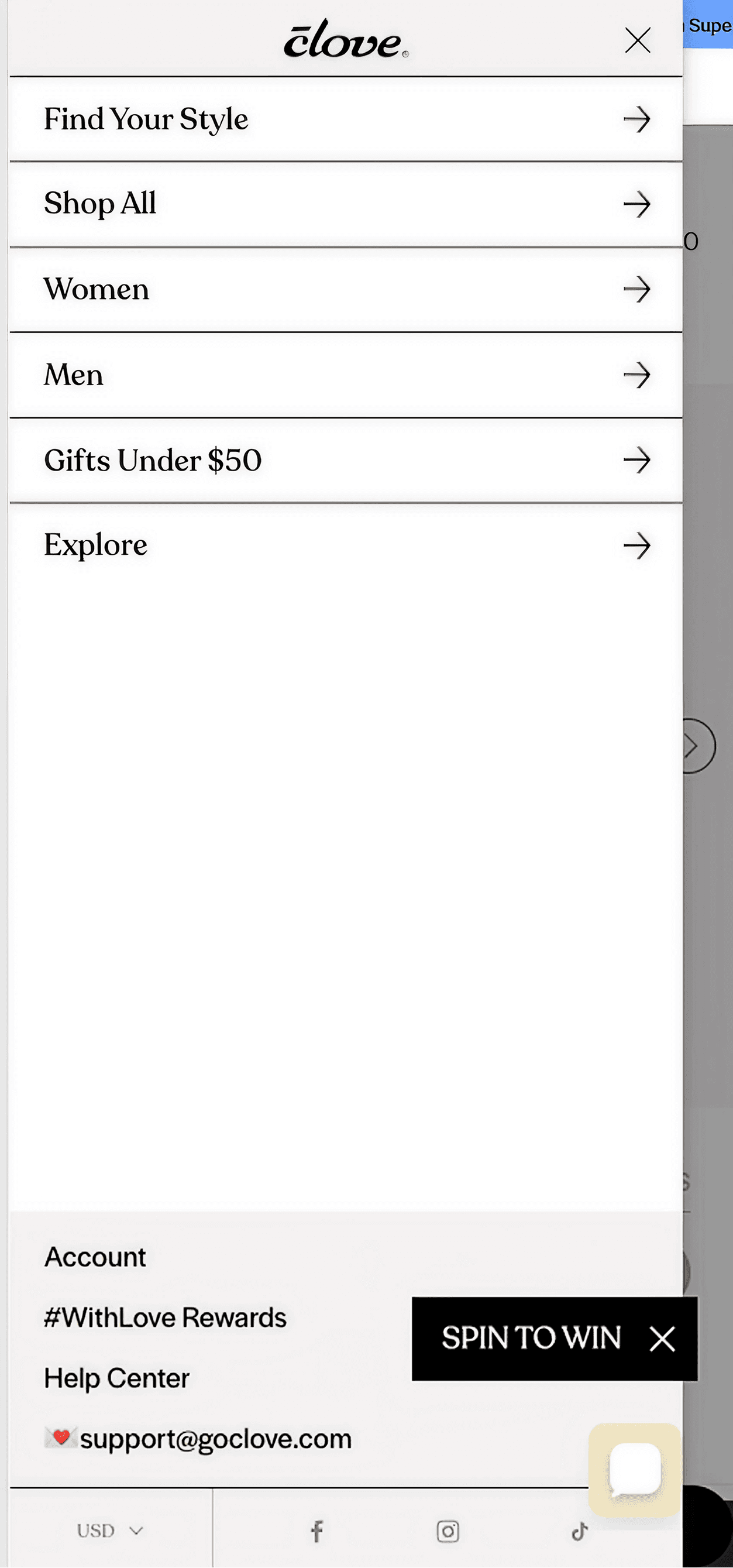
01
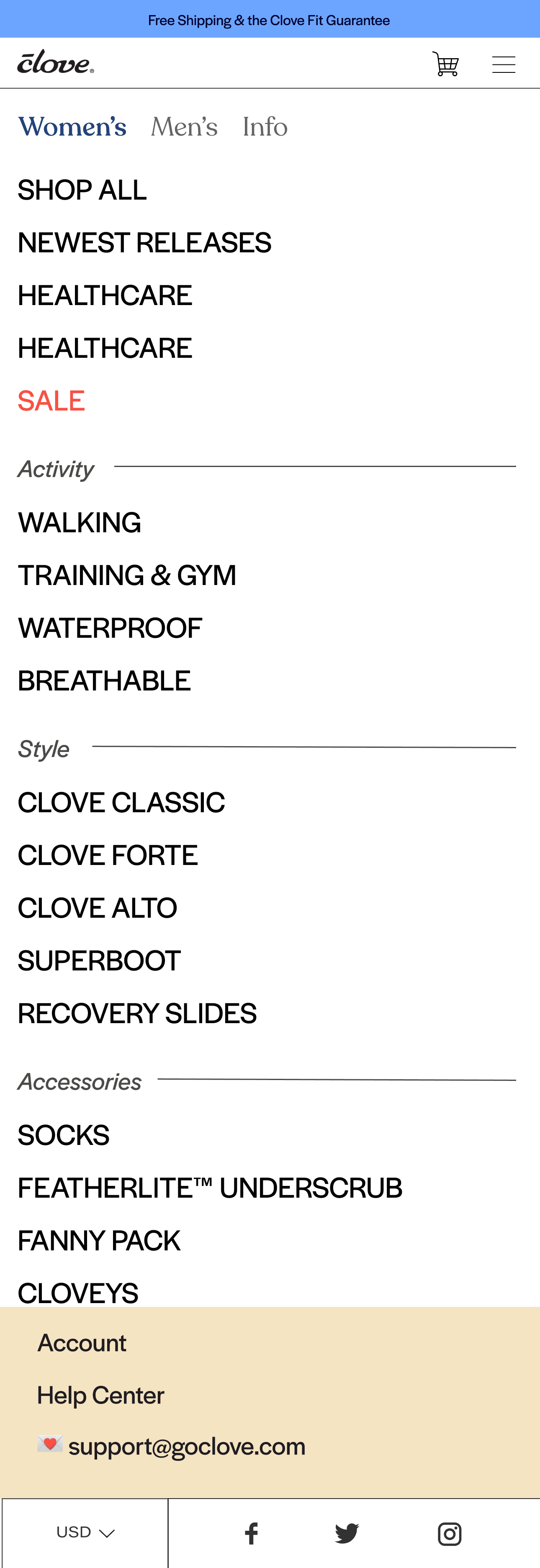
Old Navigation (A)
01
Multiple Nested Layers
It took the average users over 30s to find a product they were looking for
02
Disjointed product imagery
Product imagery is not consistent which makes it difficult for users to digest product names and types
03
Inconsistent scrolling
Within the sneakers section, we can see that the experience is asking for users to scroll both horizontally and vertically to see products, which is unintuitive.
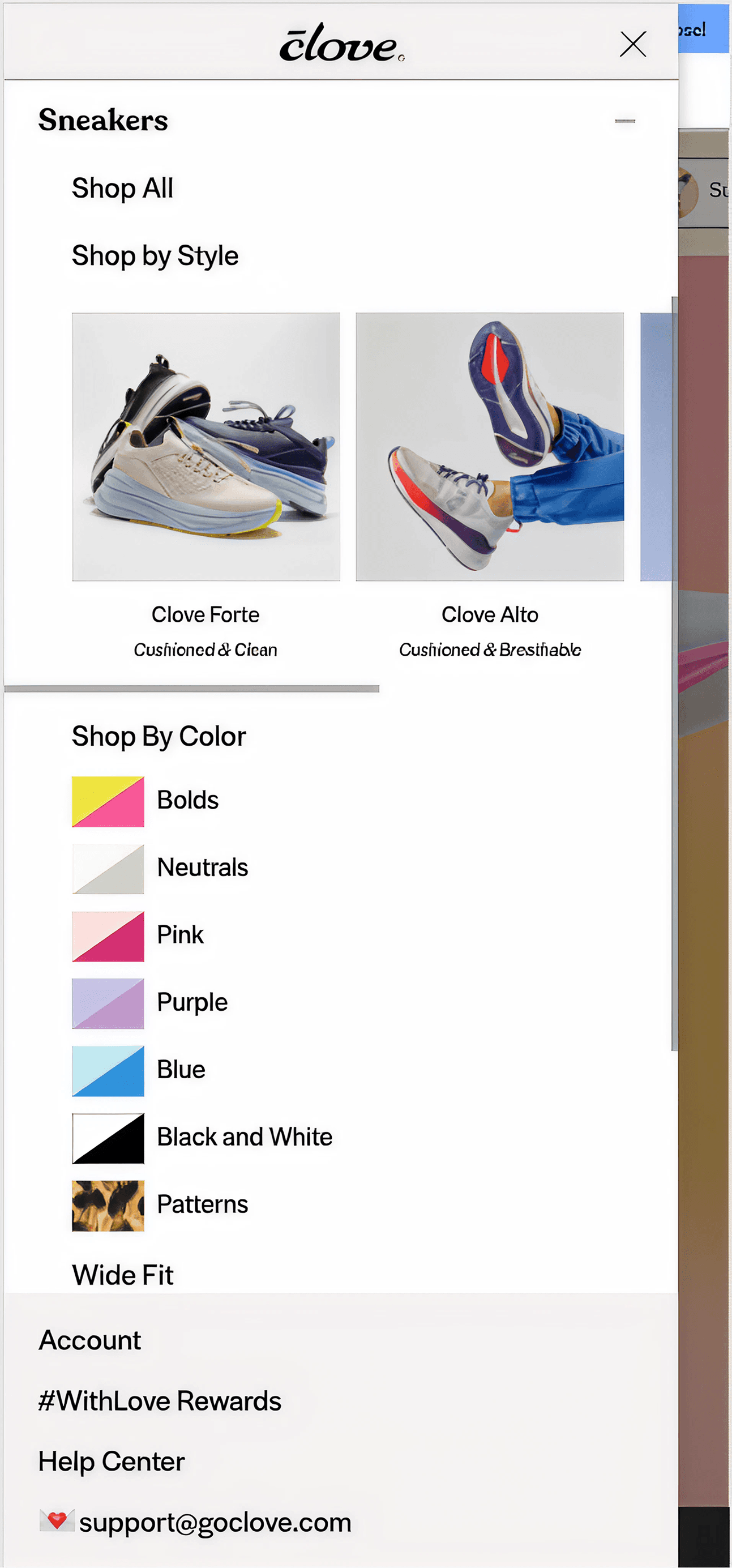
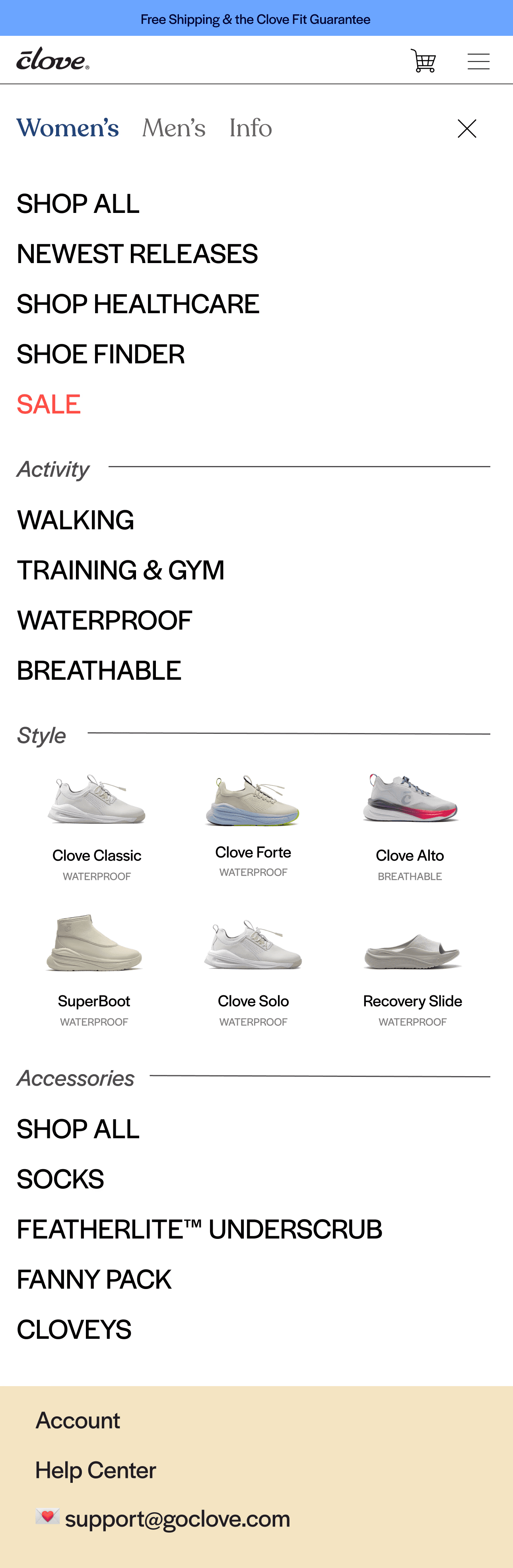
02
New Navigation (B)
01
Flat, Intuitive Scructure
The user can immediately see all product offerings, and are not forced into taking any particular action on the first screen
02
Consistent Product Imagery
By replacing product imagery with consistent swatches and including clear function related taglines really improved engagement and product education
03
Clear Visual Heirarchy
I broke down links into separate categories - Top Features Collections, Shop by Activity, Shop by Style and Accessories to reduce visual overload.
03
Reflects Lifestyle-forward ethos
Using bold font choices and visual style tied together well with the brand evolution
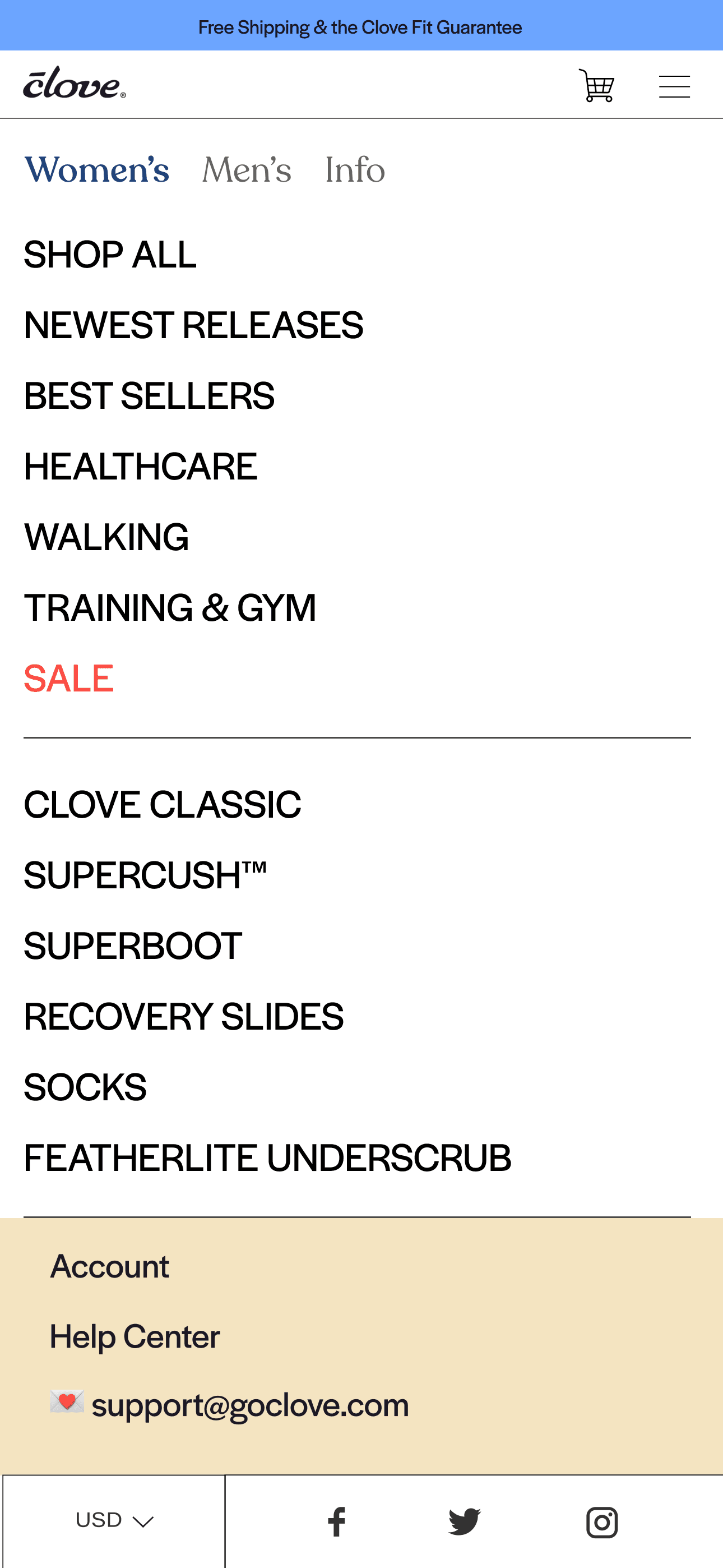
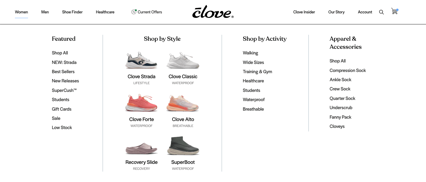
03
New Desktop Navigation (B)
📝 Prototype Testing
I conducted structured prototype testing interviews to validate whether the new navigation improves product discoverability, reduces cognitive load and bounce, aligns with how users naturally categorize products and provides a more frictionless mobile-first experience
01
Structure
I created two high-fidelity, interactive Figma prototypes. I ran 1:1 moderated tests with 6 participants. Each user was asked to complete tasks in both versions.
02
Tasks
We asked users: “You’re looking for something waterproof. Where would you go?”, “Find a pair of shoes you would wear to work a 12-hour shift.” Encouraging participants to think out loud, followed by further open-ended questions
03
What we Measured
Click-through success (Could users complete the task in less than 3 clicks?)
Navigation confidence (Did they feel “lost” at any point?)
Time to first interaction (How long until they clicked a relevant link?)
Label clarity (Were terms like “Breathable” and “Walking” intuitive?)
Preference recall (Which version did they prefer and why?)
04
Sample Feedback
“I didn’t even realize how lost I felt in the old menu until I saw this one. The new version is way more straightforward.”
“I like there is a category for walking since I'm on my feet 10+ hours a day.”
"The labels underneath the shoes are pretty helpful and let's me know immediately the kind of shoe I'm looking for"
Key insight: It took the average user less than 12 seconds to make their first click
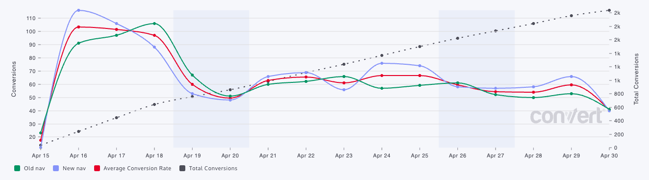
Post-Lauch Metrics
We soft-launched the new nav to a segmented group (50% of mobile users) and tracked key metrics:
02
The Numbers:
+ 6.93% increase in Revenue per Visitor (RPV)
+ 6.19% increase in Conversion Rate (CR)
+ 11.90% increase in PDP visits
+ 6.69% increase in Add to Cart Rate (ATC)
+ 3.86% increase in Reduced Bounce Rate
🔁 Iteration Based on Testing
Given the success of the launch and prototype testing, we only made minor changes to the Navigation
01
Including more Links
A few users mentioned that they still had a hard time finding wide sizes, so we included that within the new navigation and added a few more links.
02
Section Reordering
We re-ordered the navigation to bring Shoe Styles up based on click through rate, and what users were looking for.
03
Retaining Social Media Links
We brought back the bottom bar from the previous navigation to maintain real estate for our social media links
🧩 Conclusion
Prototype testing confirmed that a use-case-first, flatter nav structure outperformed the legacy color- and category-based model. It allowed users to complete key shopping tasks faster, with higher confidence, and with stronger alignment to Clove’s lifestyle-forward brand narrative.
